Hi, I'm Robert. I'm a designer and developer focused on building accessible and intuitive interfaces. I sweat the small stuff so users don't have to.
Relevant work
Projects
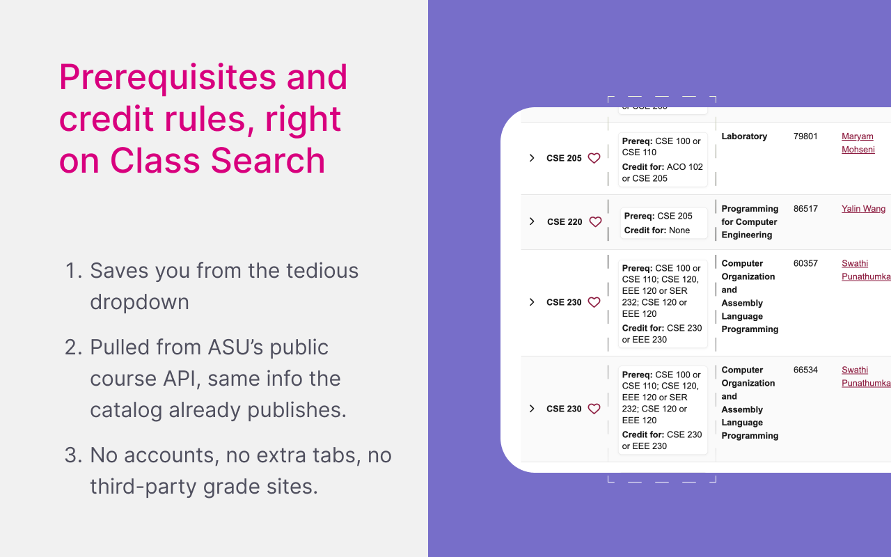
- Built to streamline signing up for classes: prerequisites and credit rules surface inline instead of opening every row and digging through dropdowns.
- You can scan the list at a glance while you scroll, with fewer clicks and less back-and-forth.
- Cards follow ASU’s typography and visual patterns so the UI reads like part of Class Search, not an add-on.
- A from-scratch component library built to understand UI at the smallest level. Still a work in progress.
Education
I was born in Chicago and raised in Eastern Europe, Serbia, then Romania, where I moved to study Social Work. It wasn't for me. I came to Arizona to pursue design instead, and I've never looked back. I'm currently a senior at ASU, interested in working at the intersection of design and engineering. I'm meticulous about details and care deeply about the small things that make products feel polished.
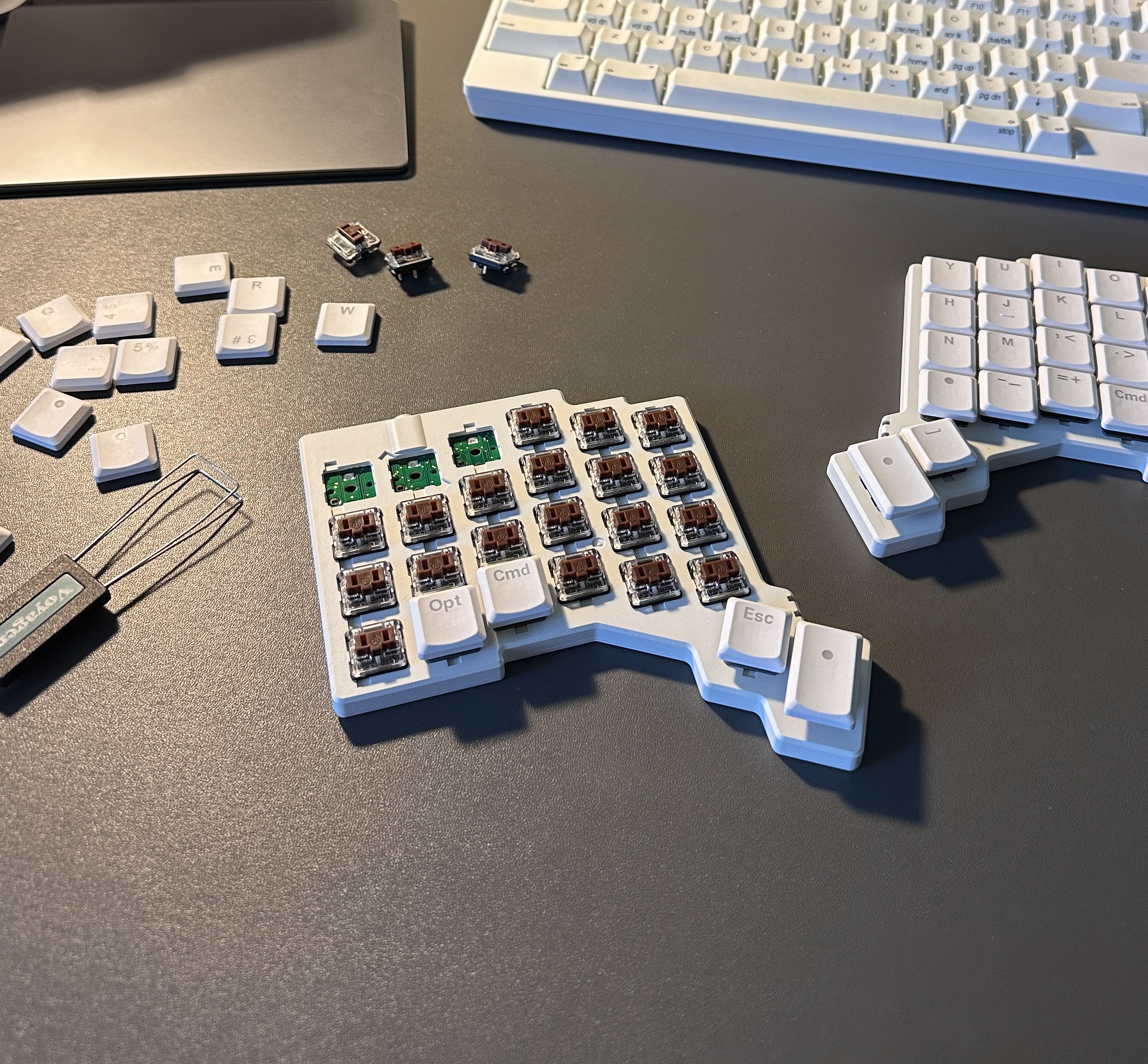
Besides designing and coding, I'm into ergo split keyboards, interior design, and hanging out with my dog Rigo. I often peruse Design Within Reach admiring Herman Miller pieces; I love the drive there through the desert.

Role
My official role was Frontend Designer. I met with the CTO and CMO biweekly, owned the design system and re-established its standards, and occasionally assisted with full redesigns of screens and webpages.
Note
Some elements of the original designs have been slightly modified or simplified for intellectual property purposes. The core layout decisions, UX reasoning, and visual improvements remain representative of the work completed during the internship.
Website
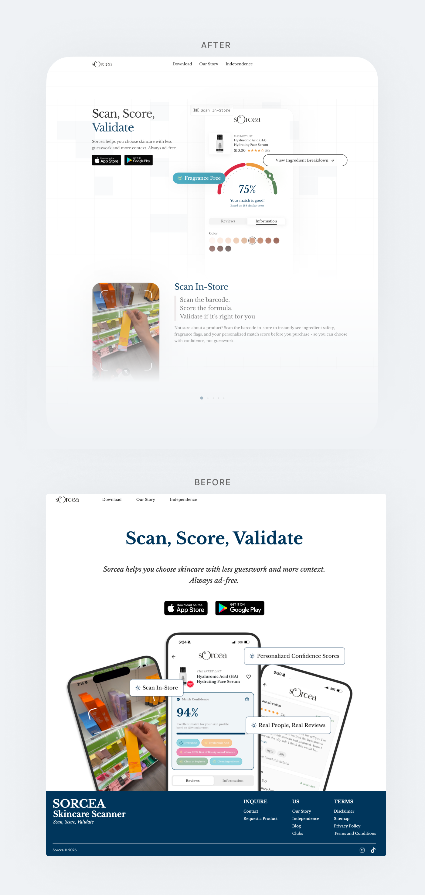
The original landing page relied mostly on text and static phone mockups to explain the product. I redesigned the hero section so the score visualization appears immediately, allowing visitors to understand the idea of the product within the first few seconds. Instead of reading paragraphs to figure out how it works, users now see the scoring system right away. I simplified the layout so the score graphic becomes the main focus and clearly shows the “scan, score, validate” concept. The redesign also adds visual interest so the page feels more engaging and less static.
Home Page
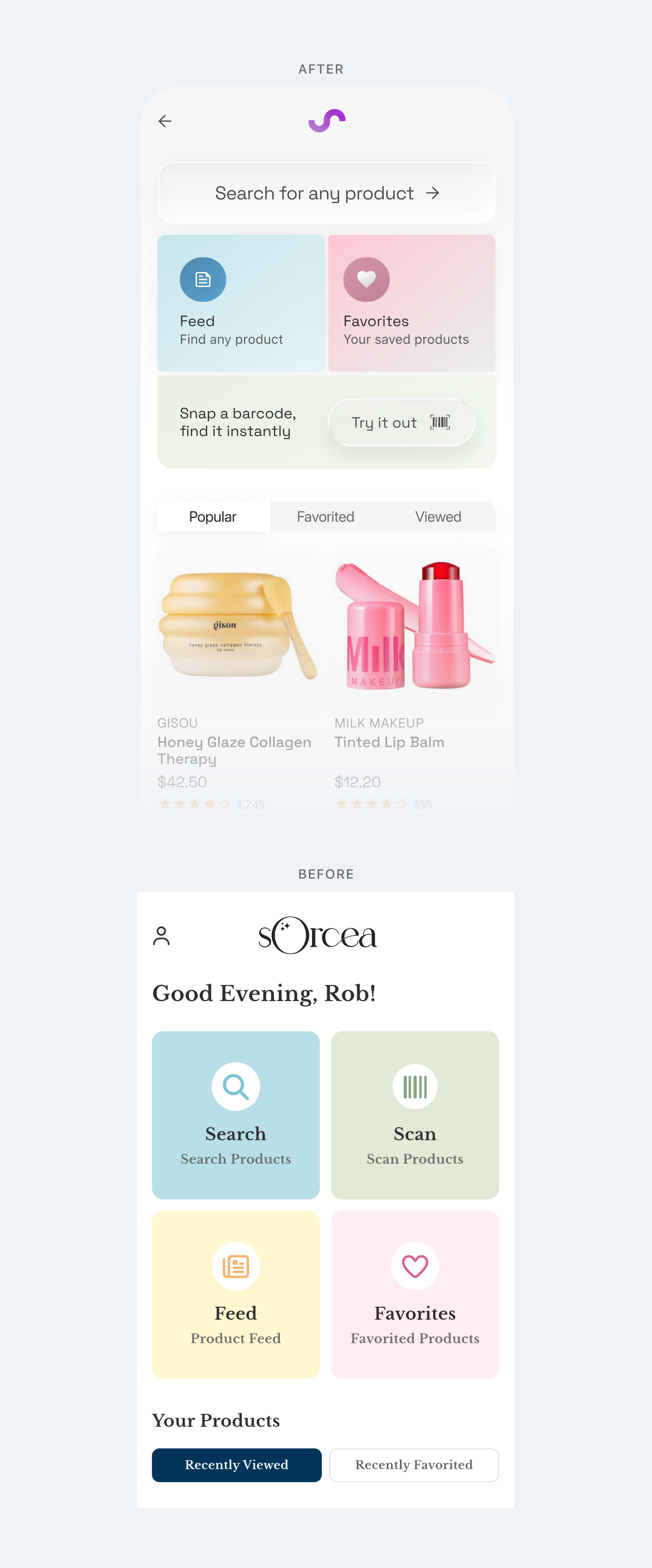
The original home screen showed the main actions in a simple grid that did not strongly guide users toward the most important tasks. I redesigned the layout to create clearer hierarchy and make actions like searching and scanning more prominent. The screen now uses card-style sections that make it easier to scan quickly. I also added product visuals and browsing sections so the interface feels more dynamic and gives users something to explore right after opening the app.
Product Page
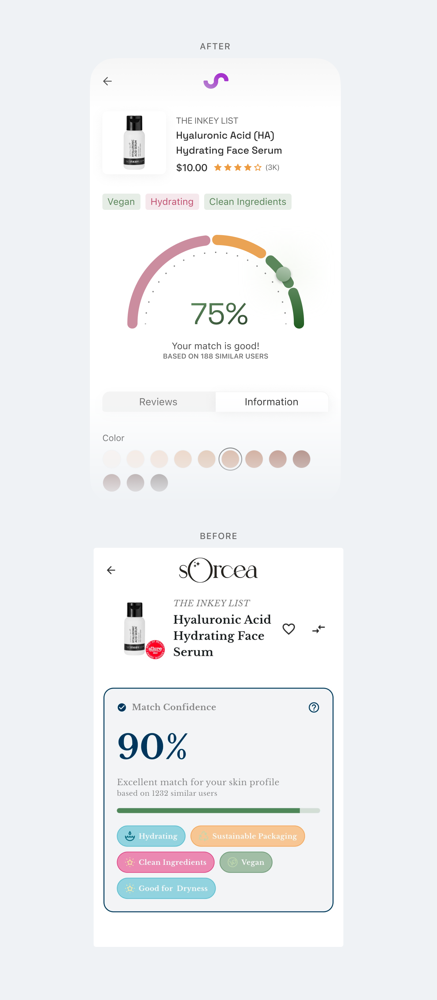
The original product page relied mostly on text and a percentage number to show compatibility scores. I redesigned the screen to feature a large visual score meter so users can understand the result immediately. The arc-style visualization shows how well a product matches a user’s skin profile at a glance. Supporting details like ingredients, tags, and reviews were moved into cleaner sections below the score so the main result stays the visual focus.
Impact
These redesigns focused on making the product easier to understand quickly and adding stronger visual engagement. During internal discussions, the team noted that the new product score visualization helped keep users on the page longer. Retention on the product screen was estimated to be about 2x higher, with more users continuing to explore ingredients and reviews. The clearer landing page also appeared to increase engagement, with roughly 30–40% more users continuing past the hero section after the redesign.
Overview
Over the past year, I have been designing and refining an experimental UI component library from scratch. The goal was never to ship a product. It was to understand interface components at the most microscopic level possible: how a button actually works, what makes a dropdown feel right, why certain spacing decisions matter more than others. This is still very much a work in progress.
Most designers work with existing design systems. They pull a button from a library, drop it in, and move on. I wanted to go deeper. I wanted to know what happens when you strip a component down to nothing and rebuild it piece by piece. What are the smallest decisions that shape how something feels? That question is what started this project.
The Components
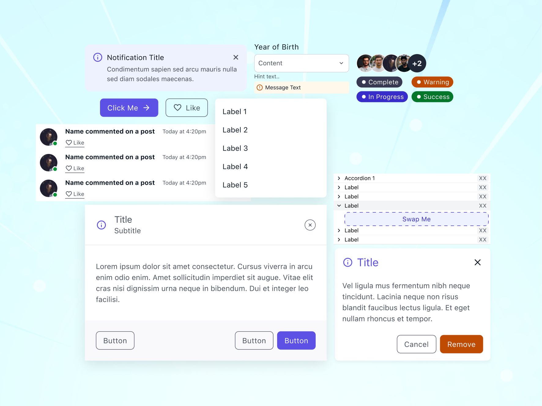
The library currently spans over 20 components: tooltips, alert bars, buttons, avatars, dropdowns, input fields, search bars, dialogs, slots, chips, progress bars, feeds, notifications, pagination, badges, tabs, tables, toggles, accordions, banners, and mobile navigation. Each one was designed individually, not generated from a template. I started with the simplest ones (buttons, badges, chips) and worked my way toward the more complex patterns like dialogs and data tables.
The process for each component was the same. I would look at how it appears in products I use daily (Linear, Figma, Notion, Apple’s HIG, Material Design) and then ask: what is the minimum this component needs to function? What states does it have? What edge cases break it? Then I would design my own version from zero, not copying any specific system but learning from all of them.
Structure

Organization matters as much as the components themselves. Every component lives in its own file with a clear naming convention. It is a structured system where each piece has a defined place. Each one is isolated so it can be studied, iterated on, and improved independently.
This kind of organization reflects how I think about design systems in general. A component library is only useful if you can find things and if every piece has a reason to exist. If a component cannot justify its own file, it probably should not be a component.
Foundation

Before any component was designed, the foundation had to be right. The styles layer defines colors, typography, containers, grids, and icons. These are the primitives that every component inherits from. Getting the foundation wrong means every component built on top of it carries that mistake forward, so I spent a disproportionate amount of time here.
Colors were defined as semantic tokens, not just hex values. Typography follows a scale generated with Typescale, with numbers rounded up for cleaner values. Containers and grids set the spatial rules that components live inside. Icons are from Material Design, which offers a huge library and consistent visual language that scales well across components.
In Context

To test whether the components actually hold up, I assembled them into full interface compositions. This is where theory meets practice. A button might look perfect in isolation, but the real test is whether it still works next to a dropdown inside a card inside a layout. Placing components into realistic screen compositions revealed spacing issues, contrast problems, and hierarchy conflicts that I never would have caught otherwise.
This was a stress test to see if the components actually hold up when placed together in real layouts. It helped me catch spacing issues, contrast problems, and things I would have missed working on components in isolation.
What I Learned
I underestimated how in the weeds this kind of work can be. A button sounds simple until you account for every state, every size, every edge case. A 2-pixel change in padding shifts how a button feels. A slightly off hover timing makes the whole interface feel slow. Border radius on a chip versus a badge versus a button is not just a style choice. Each one signals something different to the user, and getting it wrong makes things feel off even if nobody can point to exactly why.
I also learned that you do not really understand a component until you have built it yourself. Using someone else's design system teaches you how they think. Building your own teaches you how you think. That difference matters.
This project is ongoing. I keep coming back to it, refining things, adding new components, and sometimes scrapping pieces and starting over.
250+ active users across installs.
How it was built
Extensions bundle everyday web tech: HTML for lightweight panels, CSS written so typography and spacing line up with how ASU already styles Class Search, and JavaScript for parsing plus DOM updates.
Manifest V3 declares host permissions for specific degree-search URLs. Background logic stays minimal; most work happens in the tab via the content script so user data never touches a custom server.
Tests are mostly manual: load a known degree page, verify prerequisite and credit-for chips against catalog logic, resize the window, repeat after ASU ships markup tweaks. When selectors drift, I patch them in one module so future edits stay quick.
Overview
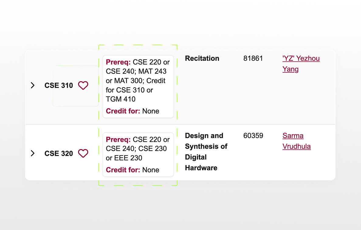
ASU Prereq Helper is meant to smooth enrollment UX on Class Search. You usually have to click into a class and comb through dropdowns to see prerequisites or what a section counts for. The extension pulls that context up next to each row so you can read it while you scroll the list, with less friction and fewer detours.
I designed the cards to sit visually inside ASU’s existing system: same type rhythm, familiar maroon accents, spacing that matches the surrounding UI so it feels like it belongs there. I built it for myself first, then refined it for classmates; it only runs on supported ASU pages in your browser and does not phone home to a separate backend.
On the page
The injected panels hug each listing row: prerequisites on one line, credit rules underneath where relevant. Nothing replaces ASU’s controls; you still enroll through their flows.