Personal Design System
Overview
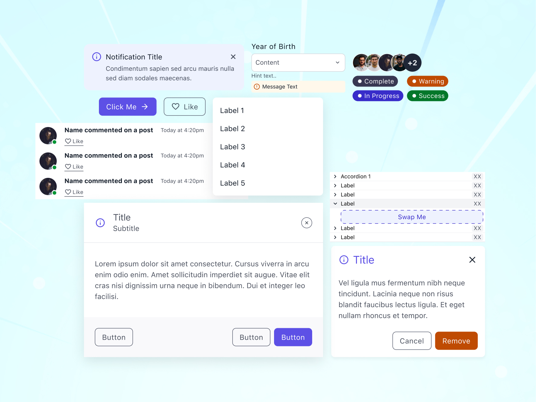
Over the past year, I have been designing and refining a UI component library from scratch. The goal was never to ship a product. It was to understand interface components at the most microscopic level possible: how a button actually works, what makes a dropdown feel right, why certain spacing decisions matter more than others.
Most designers work with existing design systems. They pull a button from a library, drop it in, and move on. I wanted to go deeper: to see what happens when you strip a component down to nothing and rebuild it piece by piece, and to understand which small decisions actually shape how something feels. That question started this project.
The Components
The library currently spans over 20 components: tooltips, alert bars, buttons, avatars, dropdowns, input fields, search bars, dialogs, slots, chips, progress bars, feeds, notifications, pagination, badges, tabs, tables, toggles, accordions, banners, and mobile navigation. Each one was designed individually, not generated from a template. I started with the simplest ones (buttons, badges, chips) and worked my way toward the more complex patterns like dialogs and data tables.
The process for each component was the same. I would look at how it appears in products I use daily (Linear, Figma, Notion, Apple's HIG, Material Design), then work out the minimum it needs to function, the states it has, and the edge cases that break it. Then I would design my own version from zero, not copying any specific system but learning from all of them.
Here's how the file itself is organized in Figma:
Design System
├── Styles
│   ├── Colors
│   ├── Typography
│   ├── Containers
│   ├── Grids
│   └── Icons
└── Components
    ├── Tooltip
    ├── Alert Bar
    ├── Buttons
    ├── Avatar
    ├── Dropdown
    ├── Field
    ├── Search
    ├── Dialog
    ├── Slot
    ├── Chip
    ├── Progress Bar
    ├── Feed
    ├── Notification
    ├── Pagination
    ├── Badge
    ├── Tab
    ├── Table
    ├── Toggles
    ├── Accordion
    ├── Banner
    ├── Mobile Navigation
    ├── Rating
    ├── Product Item Mobile
    ├── Modal
    ├── Invite
    └── Cart
Structure
Organization matters as much as the components themselves. Every component lives in its own file with a clear naming convention. It is a structured system where each piece has a defined place. Each one is isolated so it can be studied, iterated on, and improved independently.
This kind of organization reflects how I think about design systems in general. A component library is only useful if you can find things and if every piece has a reason to exist. If a component cannot justify its own file, it probably should not be a component.
Foundation
Before any component was designed, the foundation had to be right. The styles layer defines colors, typography, containers, grids, and icons. These are the primitives that every component inherits from. Getting the foundation wrong means every component built on top of it carries that mistake forward, so I spent a disproportionate amount of time here.
Colors were defined as semantic tokens, not just hex values. Typography follows a scale generated with Typescale, with numbers rounded up for cleaner values. Containers and grids set the spatial rules that components live inside. Icons are from Material Design, which offers a huge library and consistent visual language that scales well across components.
In Context
To test whether the components actually hold up, I assembled them into full interface compositions. This is where theory meets practice. A button might look perfect in isolation, but the real test is whether it still works next to a dropdown inside a card inside a layout. Placing components into realistic screen compositions revealed spacing issues, contrast problems, and hierarchy conflicts that I never would have caught otherwise.
This was a stress test to see if the components actually hold up when placed together in real layouts. It helped me catch spacing issues, contrast problems, and things I would have missed working on components in isolation.
What I Learned
I underestimated how in the weeds this kind of work can be. A button sounds simple until you account for every state, every size, every edge case. A 2-pixel change in padding shifts how a button feels. A slightly off hover timing makes the whole interface feel slow. Border radius on a chip versus a badge versus a button is not just a style choice. Each one signals something different to the user, and getting it wrong makes things feel off even if nobody can point to exactly why.
I also learned that you do not really understand a component until you have built it yourself. Using someone else's design system teaches you how they think. Building your own teaches you how you think. That difference matters.
A project like this could technically run forever: there's always one more component to add. So instead of an open-ended timeline, I measured completeness against a concrete benchmark: once the library had everything needed to design a fully functional e-commerce app, browsing, filtering, checkout, accounts, notifications, and activity, I considered the system done. That scope covers most of what a real product interface needs, which made it a natural, deliberate stopping point rather than an arbitrary one.
