Frontend Designer Internship
Sorcea · Startup / Spring 2026
Role
Day to day, I was really acting as a design system designer. My formal title was Front-End Designer.
It started with reinventing the design system and building a coherent base for the whole product. From there, it turned into adapting each component as the iOS app was actively being developed, which meant a lot of back-and-forth with the CMO and CTO to keep the system and the build in sync. Along the way, I learned a lot about how an early-stage startup actually runs, and what it means to be a jack-of-all-trades designer.
Note
Some elements of the original designs have been slightly modified or simplified for intellectual property purposes. The core layout decisions, UX reasoning, and visual improvements remain representative of the work completed during the internship.
Landing Page
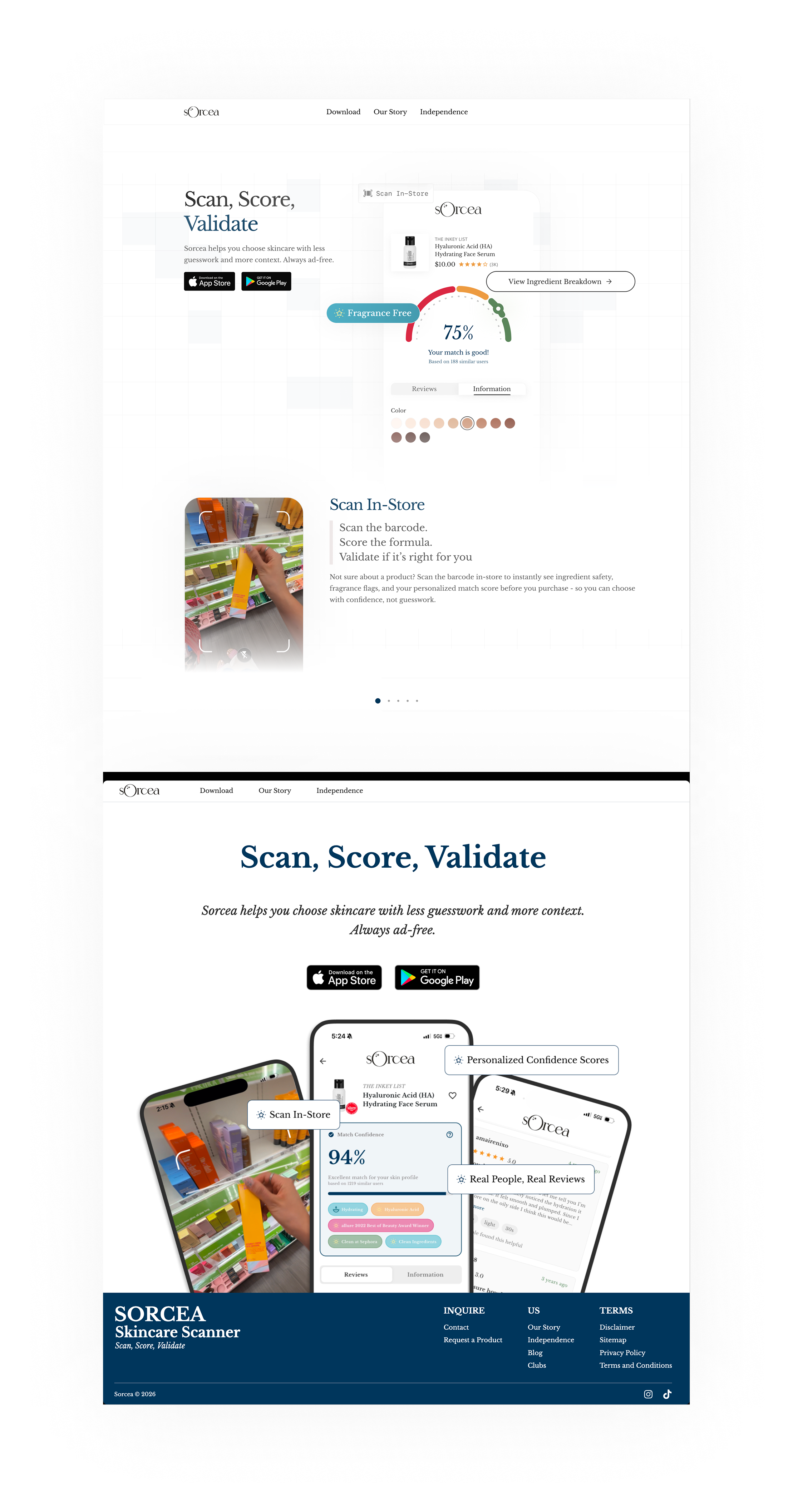
Problem: the landing page needed more information and a better structure for that information. It leaned mostly on text and static phone mockups, so a visitor had to read several paragraphs before understanding what the product actually did.
Solution: I redesigned the page in its entirety. The score visualization now appears right in the hero, so visitors see the "scan, score, validate" idea within the first few seconds instead of reading their way to it. I also rebuilt the information architecture underneath: sections now build on each other in order, from the score, to scanning in-store, to real reviews, so the page reads like a story instead of a list of features.
Click to zoom in
Search & Home
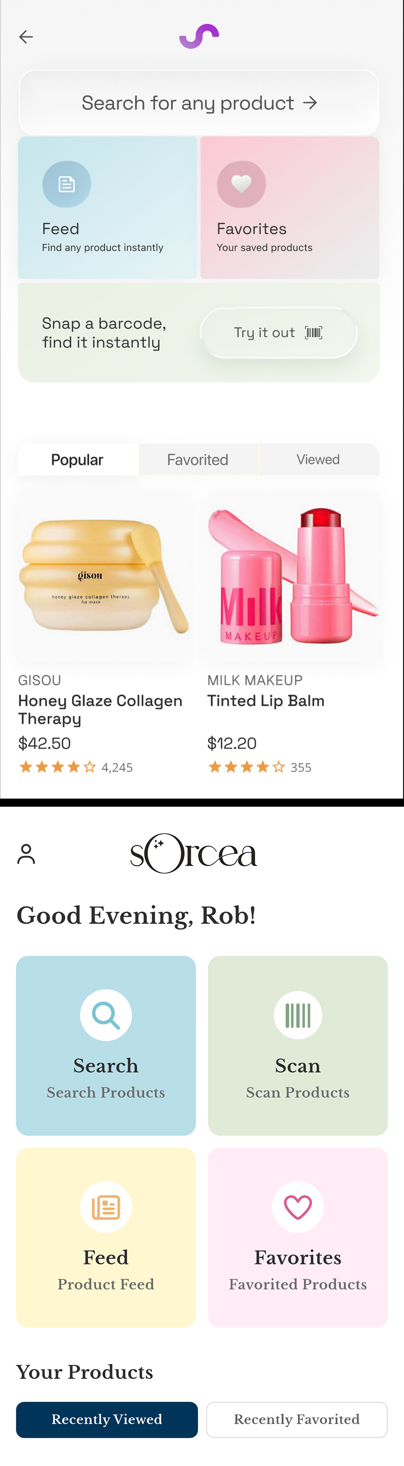
Problem: the home screen's main actions sat in four bland, identical boxes. Nothing stood out, and there was no reason to linger there once you'd tapped one.
Solution: I redesigned it to be sleek but still full of visual appeal: search moved to the top as its own prominent bar, secondary actions became distinct colored cards instead of four lookalike boxes, and I added product browsing sections underneath so there's something to explore the moment the app opens. Retention was higher, and user feedback was good.
Product Page
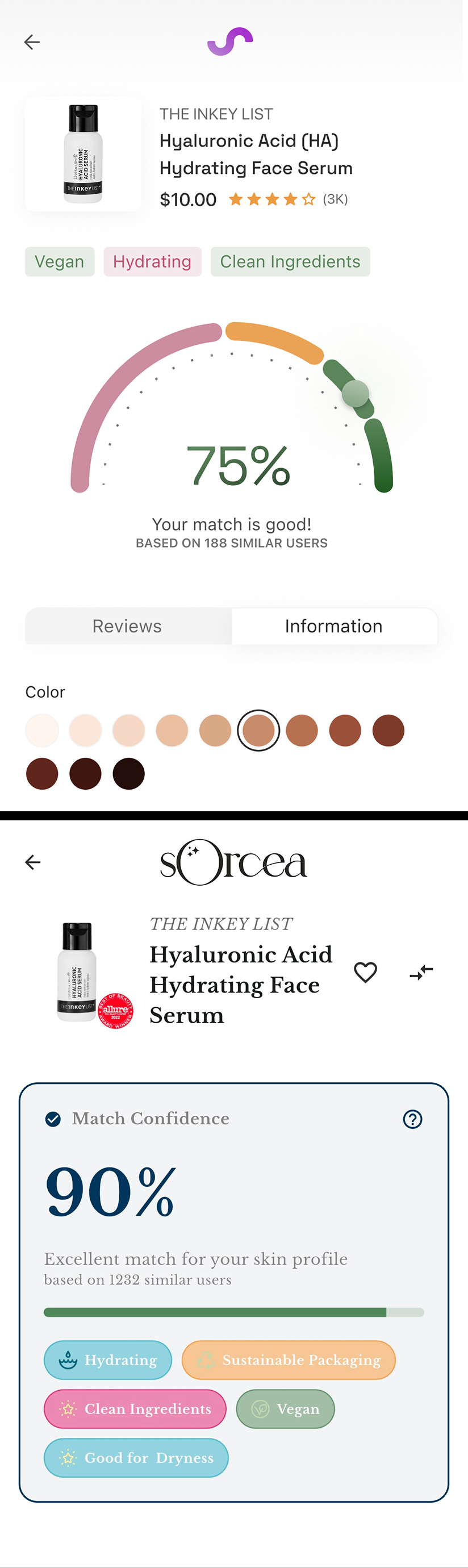
Problem: the product page showed compatibility as a flat progress bar and a percentage. It needed to animate into place like a spring, and it needed to feel more interactive overall.
Solution: I came up with a round score design, closer to a credit score meter you'd see at a bank, that springs into place and shows the match at a glance. Ingredients, tags, and reviews moved into cleaner sections below so the score stays the visual focus. Retention was higher, and user feedback was good.
Impact
These redesigns focused on making the product easier to understand quickly and adding stronger visual engagement. The new product score visualization helped keep users on the page longer, retention there was estimated to be about 2x higher, with more users continuing to explore ingredients and reviews. The clearer landing page also appeared to increase engagement, with roughly 30–40% more users continuing past the hero section after the redesign.